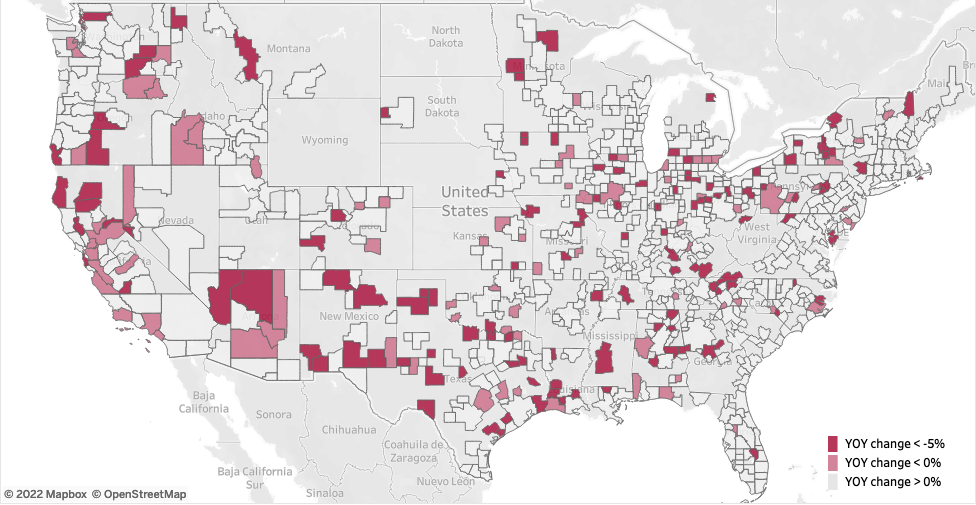
Price Decline YOY Map
Interactive map of price declines from peak for metros and counties.
Data from Redfin Data Center.
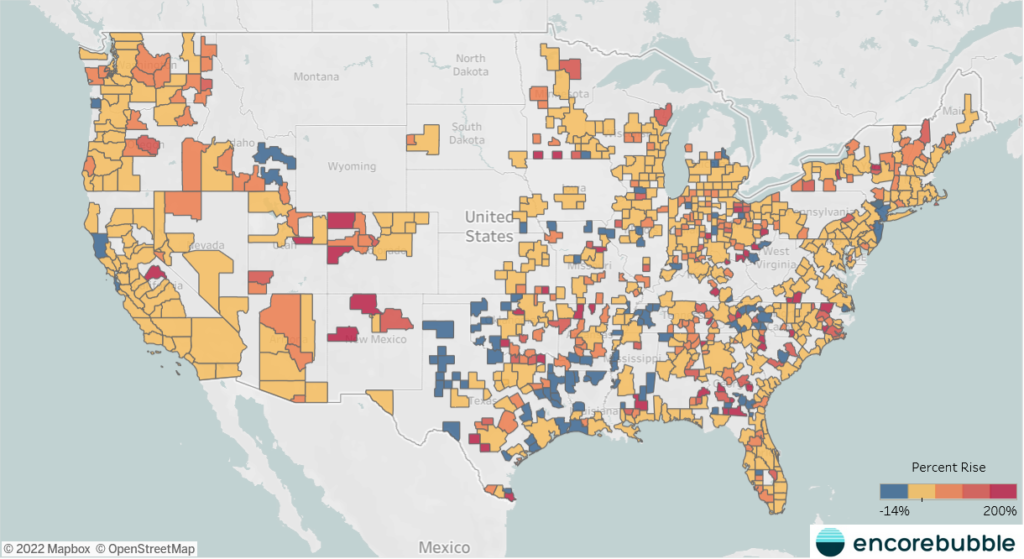
Appreciation since Prepandemic
Interactive map of the appreciation since before the pandemic.
Data from Redfin Data Center.
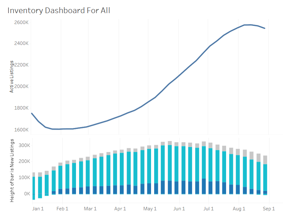
Inventory Dash
Interactive dashboard of inventory related statistics by metro.
Data from Redfin Data Center.
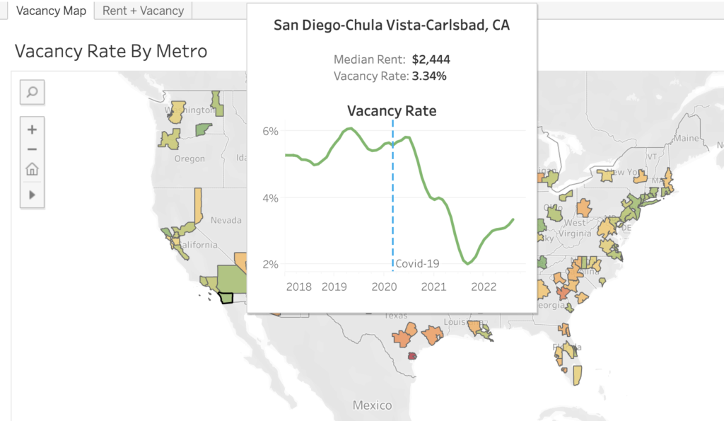
Rental Vacancy Map
Map of rental vacancy in major metros, with rent estimates tab.
Data from ApartmentList.
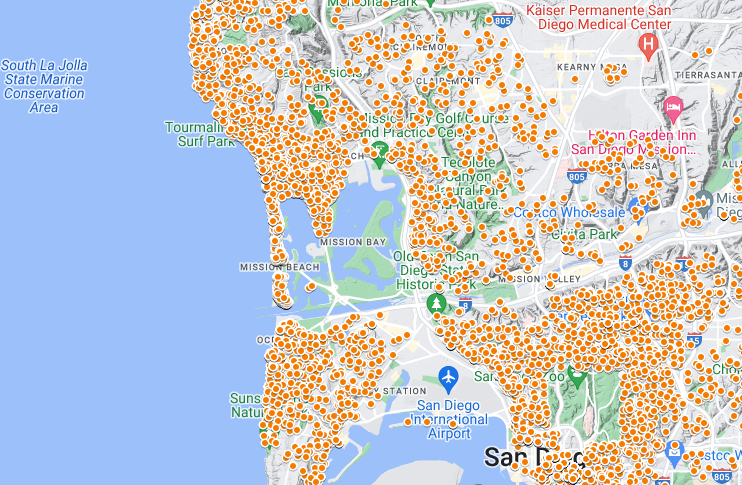
San Diego STR Map
Interactive map of San Diego STRs registered for vacation certificates.
Data from City of San Diego
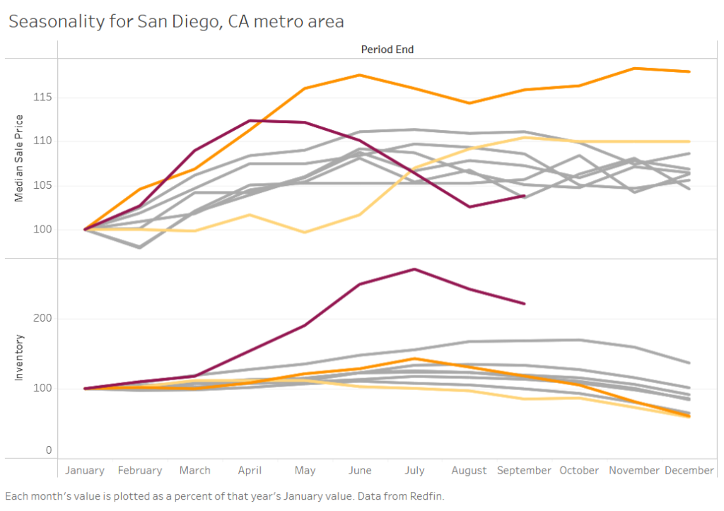
Seasonality
Interactive graph of the growth of price and inventory over the year, compared to pre-pandemic. Data from Redfin Data Center.