As spring heats up, the inventory is a delicate balance between sellers and buyers and I figured it was time to update the dashboard to help people suss out what’s going on in their market.
Here’s the link to the dashboard – Listings dashboard.
First, a caveat. This data is Active Listings from Redfin. Active Listings is everything listed in the last 4 weeks. It can be higher than inventory because inventory is a snapshot at the end of the month. It’s related, but not exactly the same! But it’s a pretty good stand-in.
But to help you understand the tabs, I’ll walk you through each of them here.
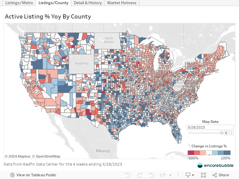
Percent change in active listings year over year
The first tab shows a map with the percentage change in listings from a year ago for metros.
Hover over any metro to see the percent change as well as a graph of listing totals since 2019.
The second tab is very similar but organized by county.
Click to activate, then hover over any county to see the percent change as well as a graph of listing totals since 2019.
Active Listings Breakdown and History
The next tab tries to compare the listings to some useful factors like
- How many new listings came on the market?
- How many pending sales happened?
- How many homes were de-listed?
Below is just a snapshot, it’s not interactive. Go to the full dashboard since this post doesn’t allow the full size layout.
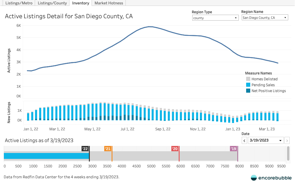
At the bottom of the chart is the historical information for this same week each year. The blue bar indicates 2023 listings and progress towards 2019 levels. There’s a marker and flag for the level of listings, same week each year. You can move change the selected date to investigate how it’s changed.
In the snapshot above you can see that the blue bar ends at the ’22 marker. It’s currently 2023 so this means we are basically at the same level as we were exactly one year ago, in San Diego, CA.
Market Hotness
Finally, this is a measure of market hotness. It represents pending / active listings so you can see how “hot” the market is compared to previous years. It indicates what the balance is between buyers and sellers.

In case you’re wondering what the calculation actually is, it’s just pending / active * 400. The 400 is a constant meant to scale the fractional values into an easier to handle number.
Final words
I wrote on my blog months ago that low inventory won’t save the housing market. I might be wrong and honestly, it certainly appears to be holding it up right now. But I do believe this tide will turn after the high season.
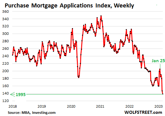
In many markets, sellers are just holding on or trying to rent properties instead. As rental vacancy continues to rise, and it is, eventually landlords and small investors will need to sell. A ton of demand has stepped out of the market already, with mortgage apps down to a 28 year low.
As I say in every disclaimer though, I could be wrong, so don’t take my word on anything. But I hope everyone can use these tools to understand their own market themselves.
Here’s the link to the dashboard – Listings Dashboard.
Disclaimer: I’m an idiot first time home buyer. I’ve never taken an econ class in my life. I’m just sharing what I see and learn as it happens. I am 100% certain I will get things wrong, so don’t take any of this as the golden truth.